This is my reflection on my project!
My name is Andrea Hernandez and for my foundation portfolio project, I created a magazine. Ever since the project was introduced to me there was no doubt in my mind I would focus the magazine on women’s fashion & lifestyle. I knew the genre was one in which I could use a passion of mine to complete this project. I decided I didn’t want to follow the normal conventions but still got inspired by well-known magazines that have established some of these conventions. VOGUE was my main source of inspiration, and when picking the style of my cover I realized I didn’t want to follow the cookie cutter cover.
Instead, I took a picture of my 23-year-old sister wearing a springtime outfit, and instead of a plain color backdrop, I included an eye-catching wall we found around the Miami Design district which relates to my main article. Although I wanted to challenge the conventions, I wanted the title to follow the normal conventions by mirroring VOGUE’s. I decided to mix a thin and elegant font with my title to create the same illusion of VOGUE. Yet, I positioned to the side my cover lines, used bright colors and a mixture of fonts throughout.
As you can see the colors, I used were colors from the backdrop of the image, tying in all of them making the cover aesthetically pleasing, and cohesive. I aimed for the pages to be less chaotic, used the same fonts throughout all the pages, but brought in colors as it was a springtime issue. I chose to follow this convention because my magazine is intended for women from 18 years of age to 30. I desire them to flip through the pages and feel that what they are reading is written by a knowledgeable writer and the format and fonts of the magazine plays a big role in conveying that feeling. Which is why I decided for my format to be sleek, easy to read with clean black font.
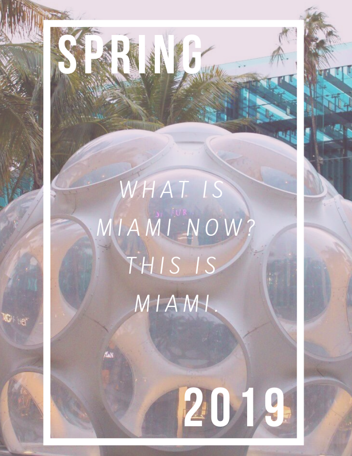
When I first began my project, I was convinced I would dedicate my article on spring trends and only spring trends. I simply wanted to do a fashion article. As I moved forward with some research I realized that although the issue is focused during springtime, the main article I was writing did not need to be on that just with clothing. Instead, I focused on the lifestyle part and wrote about the trendy places to visit in Miami. I learned from doing this project, It would take time and research to feel proud of my results. I also learned that even if I believed I was doing some things correctly there was always room for improvement. As I talked about in some of my blog posts, I used the Joomag website that my teacher had recommended. After getting the hang of the website, my work deleted, and I had to start from scratch. After fighting with my computer for days, I realized that Canva was the best choice for me since it is an app I know back and forth and am constantly using to create new things. The only thing I didn’t enjoy about Canva is that they can see the two-page layout side by side, instead, you must scroll up and down to see the pages. Regardless during this project, I truly could challenge my creativity and could use everything within Canva to make my project perfect in my eyes.
Due to my selected target audience, I would like my magazine to be distributed online specifically in apps such as Snapchat, in which people already see magazines such as cosmopolitan and Seventeen magazine. Technology is a huge part of our day to day, therefore I find it tremendously beneficial for magazines to be at the click of a button. I would also like my magazine to be printed and sold in places like local grocery stores, to high-end stores.
Throughout my project, I used a variety of technologies throughout the making of my project. I used my sister's professional camera to capture the picture from the front cover. I knew that even if my I phone had the great resolution, the lighting settings are just not the same. I wanted to make sure that the cover was taken with a professional camera that had automatic settings for the lighting especially if the cover was outside. I intended to edit the cover photo to get it right and experimented with different filters for hours on my computer until the editing was perfect. For the rest of my pictures, that were included through my two-page spread were taken and edited with my I phone on the app Lightroom. Although it was my first time working with his app, I got the hang of it fast. I mainly experimented with the vibrancy and brightness. I mainly focused on that technique to make sure my pictures came out bright, and clean. It came out just the way I hoped for.
I am overjoyed with my final product. This project allowed me to express my creativity in so many different ways.